Design is creation, process and outcome of an idea. This page offers a glimpse into the process behind crafting a brand identity for Metercube.
Brand
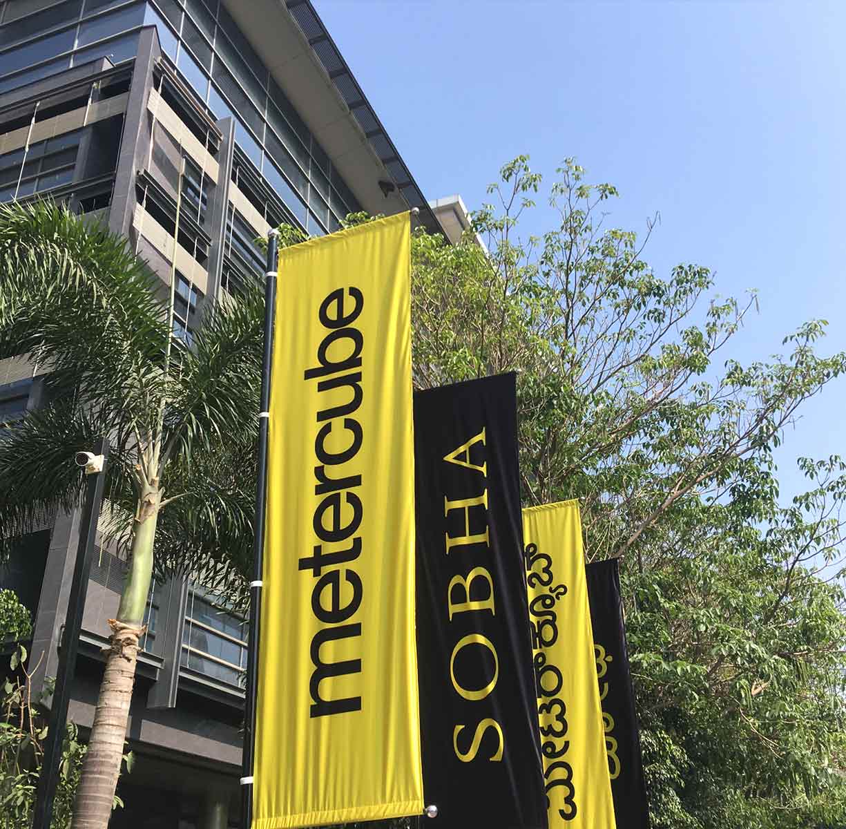
Metercube is a furniture and home decor retail venture of real estate leader Sobha Limited, which addresses the fact that our lives revolve around the physical space that we call home. As the name suggests the cubic meter m³ is the unit of volume, hence the name metercube. What I admired most about Sobha was its unwavering commitment to quality and meticulous attention to detail, which deeply resonated with my own values and greatly supported my ability to deliver.
My Contribution
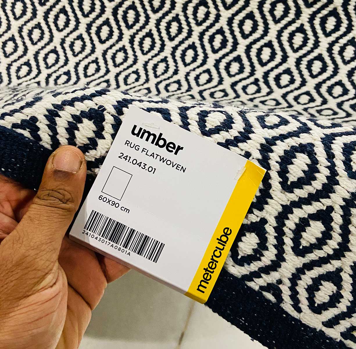
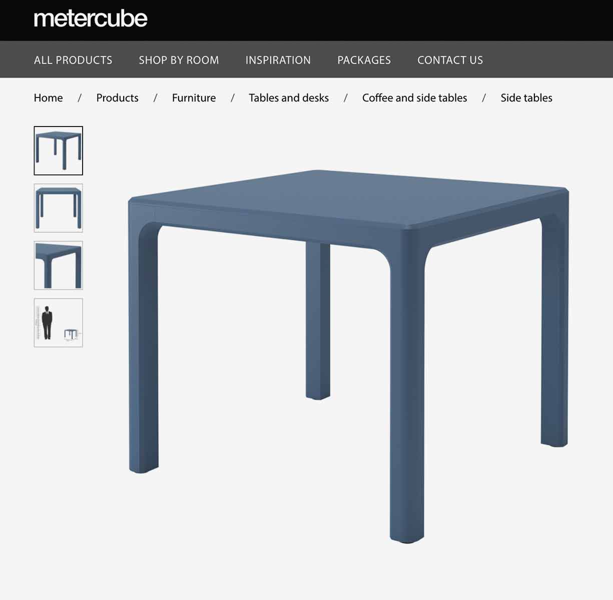
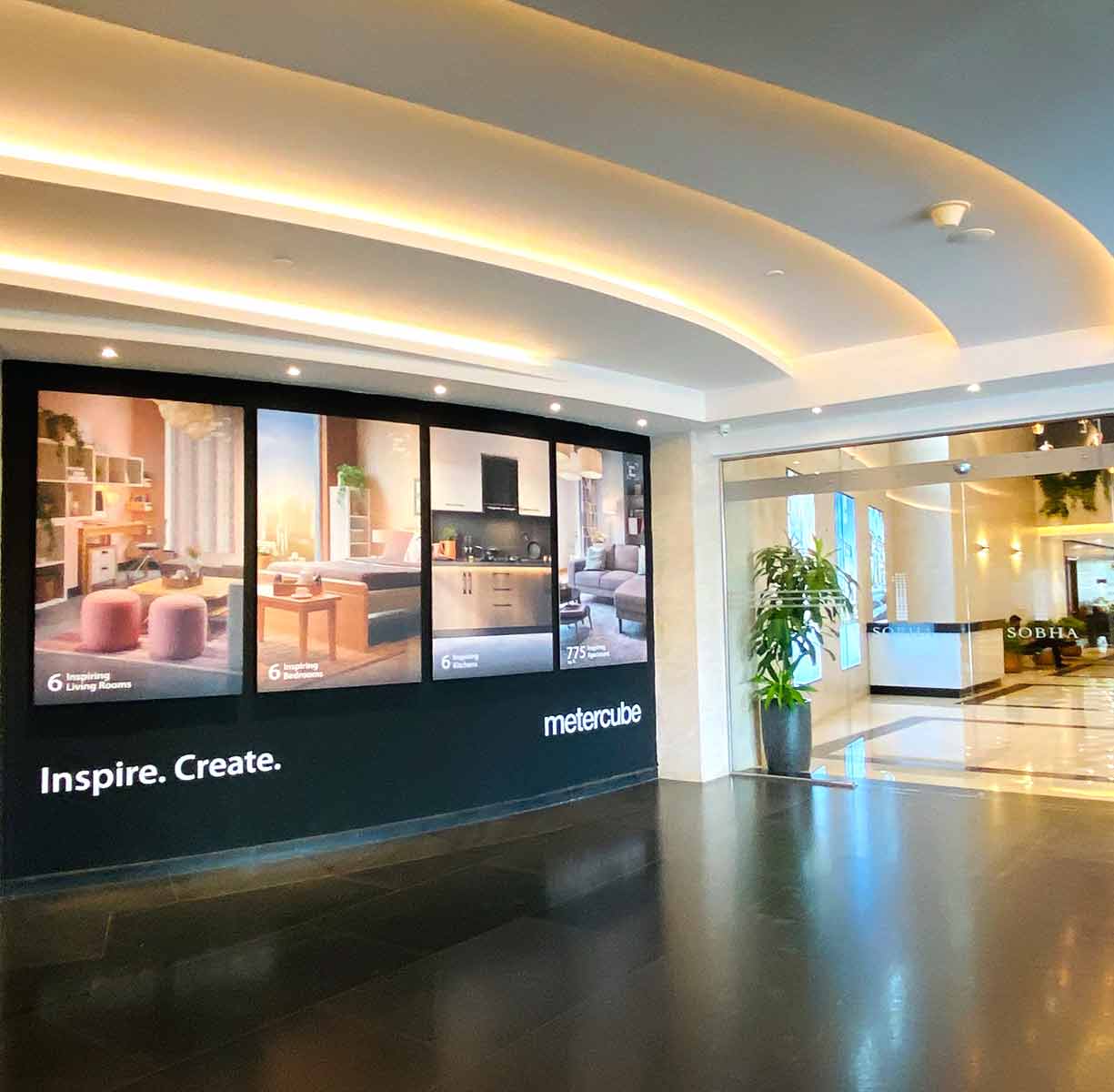
Crafting the wordmark and minimal icon for the brand, defining brand guidelines, branding various articles, product labels and creating store communication.
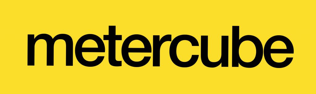
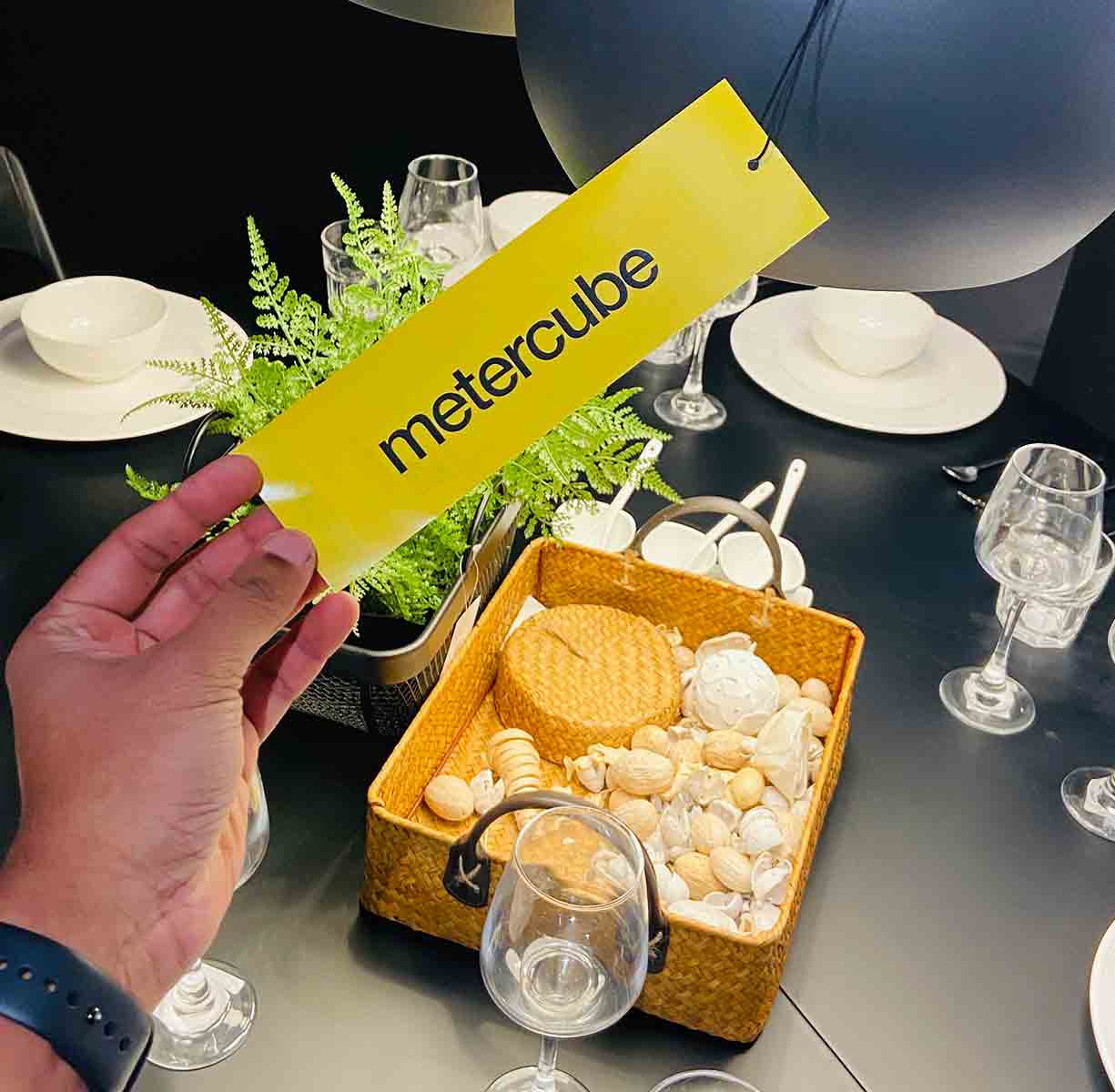
Wordmark
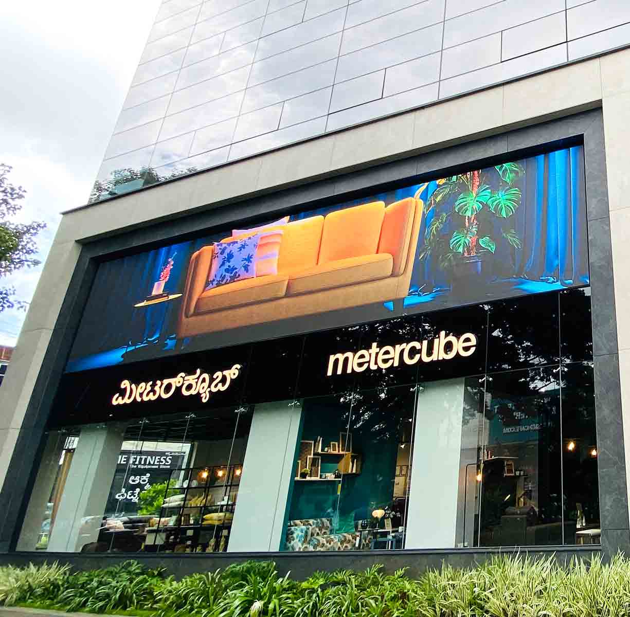
in English
When introducing a new brand to the world, it’s always good to start with a wordmark logo. This helps build brand recognition, as the audience will associate the business with the fonts and colors of your logo. Keeping it in lowercase makes it more legible and compact, while bold characteristics speak to the confidence the brand embodies. The accents were also shortened to enhance its compactness.
in Kannada
Being associated with a state in India where the regional language is the norm, it was necessary to ensure that the Kannada typeface looked like it belonged to the same family. Even though I hadn’t worked on Kannada language typefaces before, maintaining this consistency was crucial. The stress in the typeface was aligned similar to English, and protruding descenders were reduced in size without compromising the overall visual balance.
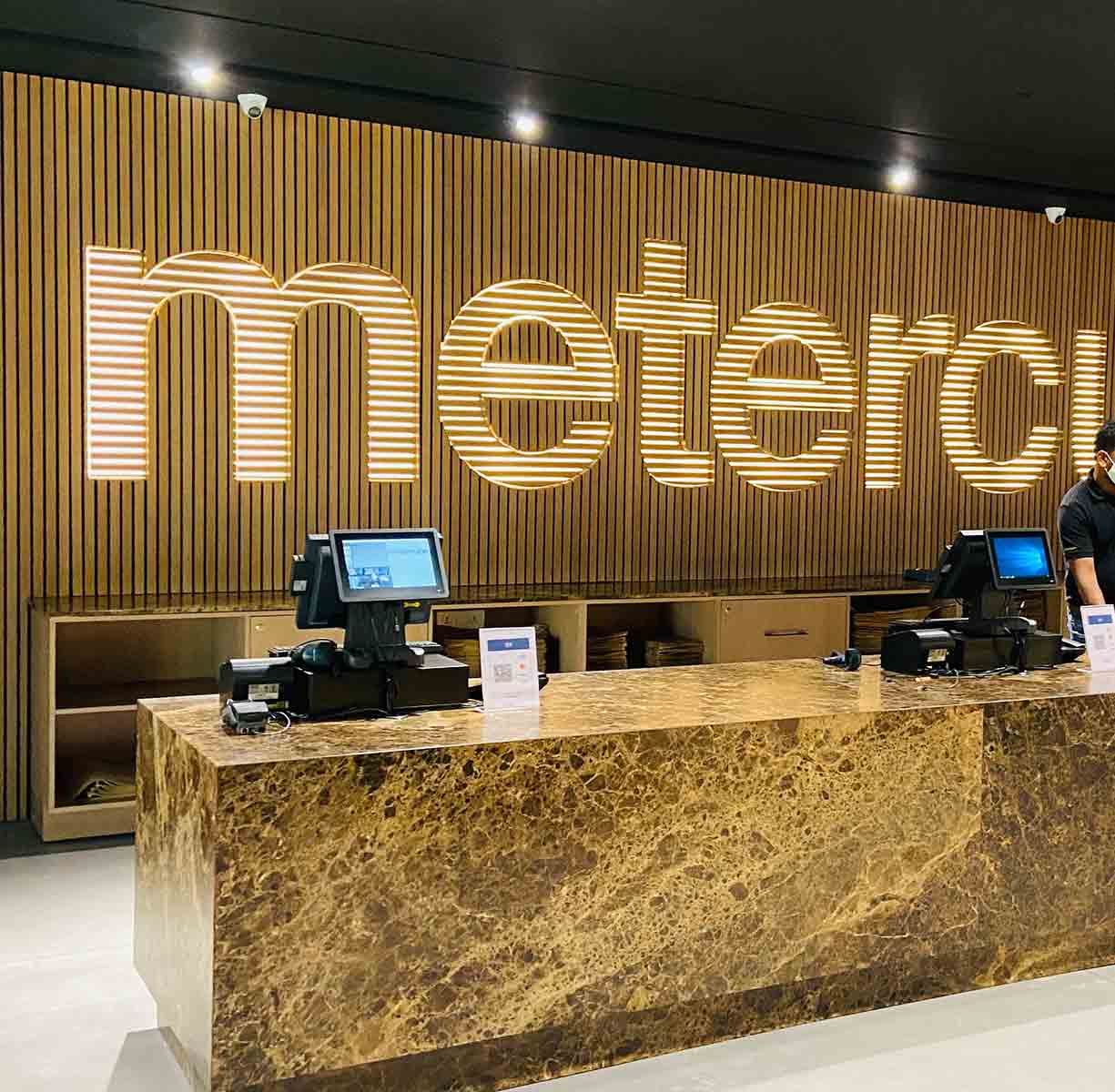
Colours
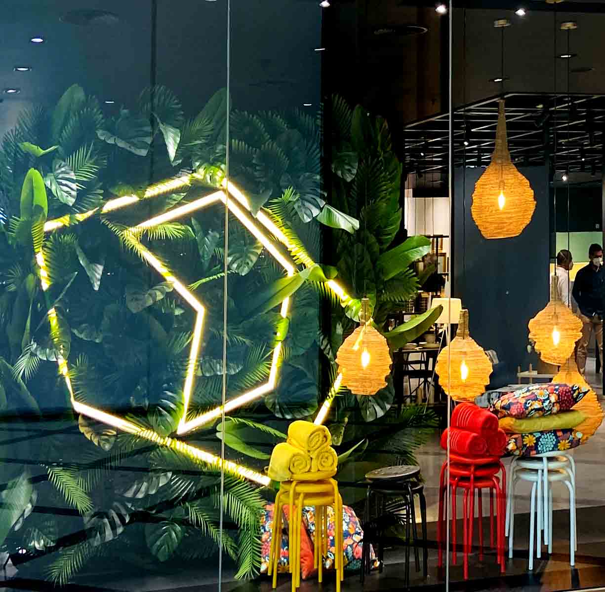
While the typeface is crucial for wordmark logos, colors should not be overlooked. A splash of colour can make the difference between a forgettable wordmark and one that stays in people’s minds. Primarily, we have used black and its variants. The brand’s directional colour is yellow, which serves as a secondary color but is sparingly used.
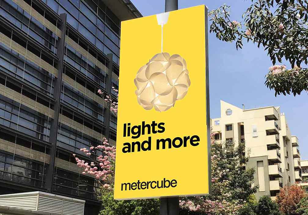
Why Yellow?
Inherited from the mother brand
SOBHA as a brand is mature and follows a muted yellow in the brand logo. As a derivative and to address a young energetic brand metercube, brighter yellow was introduced into the system as an accent.
Attention grabber
Yellow is the most visible colour, it is also the most attention grabbing colour. Yellow can be used in a certain amount to draw notice, such as on hoardings or advertisements.
Stand out in the market
There were few organised furniture and homeware retail players in the market who follow certain brand colours. The choice of an accentuating colour yellow was picked to be different from their’s.
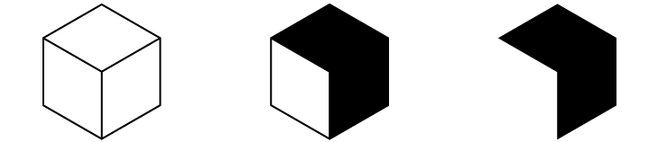
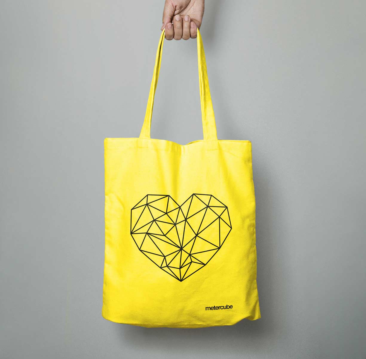
Brand Icon
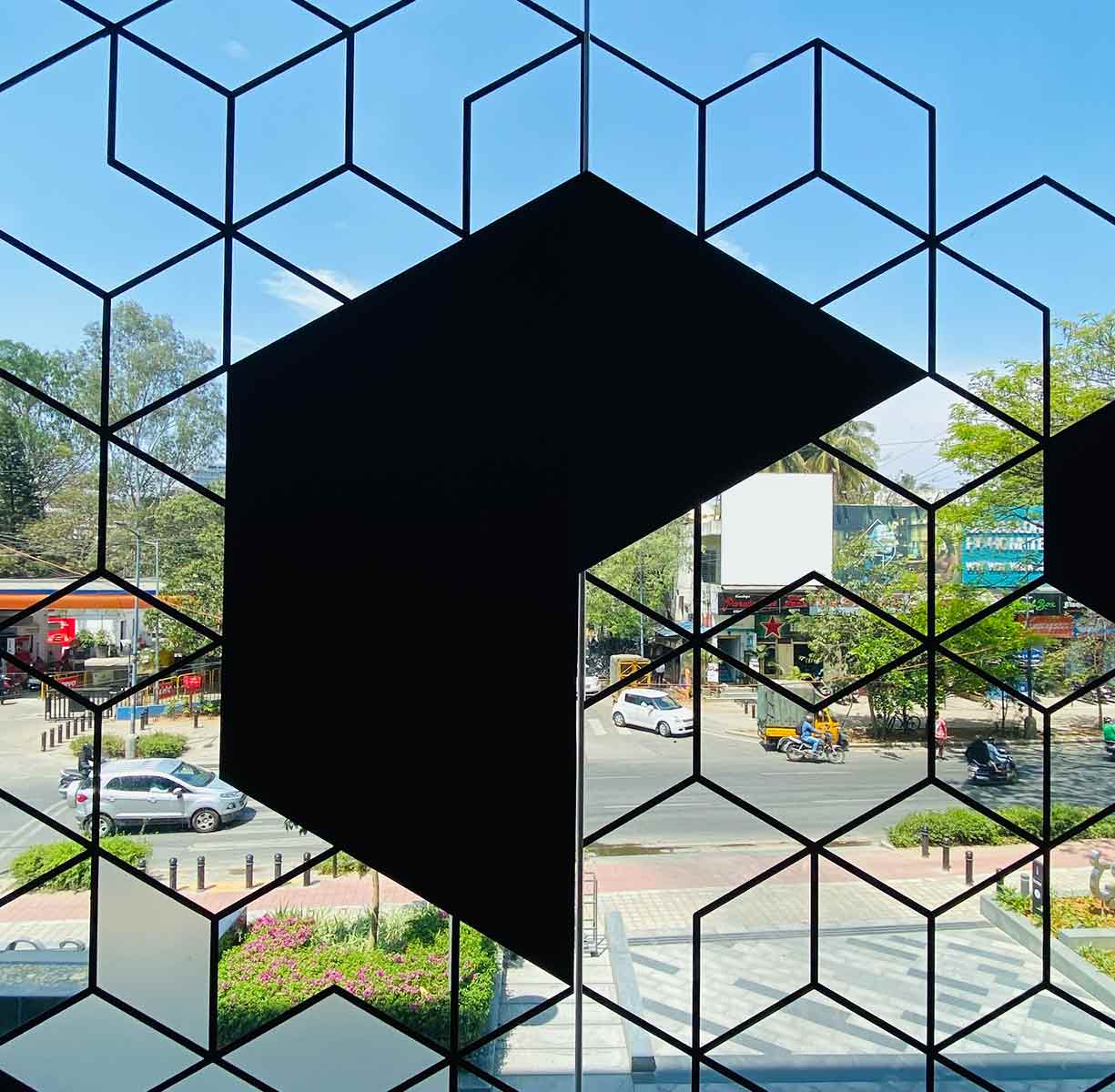
A cube can be graphically represented and interpreted in many ways. The challenge was to evoke the image of a cube in one’s imagination without depicting it directly. Before progressing to designing an iconic symbol, creating a wordmark and establishing the brand’s market placement were essential steps. The brief for this task was simple: minimal yet classy.
minimal+
monochrome+
mystery
Formation of a cube through the interplay of light and shadow.
Being monochrome the change in direction of the light hitting on the cube still continue to project the shape of the cube in one’s imagination, hence making it work in either way, dark on light or vice-versa.
The viewing orientation and selected faces makes it an upward progressive arrow, denoting growth.
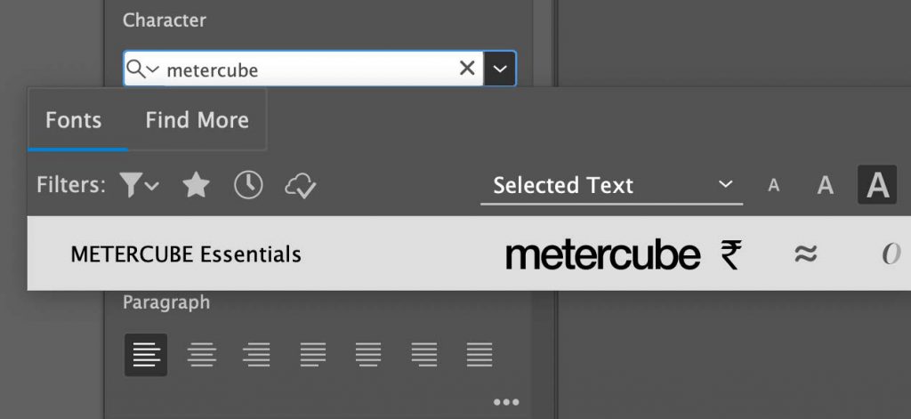
Custom Font
There were many instances where the wordmark, symbol, and other custom icons needed to be used across various applications with ease. To address this, I created a font called METERCUBE Essentials.otf. Having a font set with specific character keys assigned to these elements helps graphic designers and label makers use them easily without facing data loss.
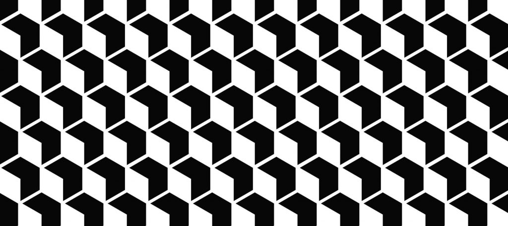
Pattern
The cube symbol, made synonymous with the brand name, was created with several other intentions in mind. It can be used in multiple ways, including tessellations, key graphical shapes, website icons, and store visual merchandising.
With critical areas defined, the concept was then unleashed, allowing the team to experiment freely and let their imaginations soar. I was confident it would remain cohesive within the same family. 🙂
My web curiosity journey began back in school days (2002) after stumbling upon a small cute book on HTML named “The Rough Guide to The Internet by Angus J Kenny”. Over time I explored MS Frontpage, Dreamweaver, modifying ready template codes and now on a WYSIWYG editor.
With a keen interest in visuals, technicalities of hosting, trying new developments in this industry remained a fun project.
I am open to feedback if you have any. Please share at hello@jasinth.com
Login Portal
for invited guests
Guests may have to log in to access more exclusive contents. Contact me at hello@jasinth.com